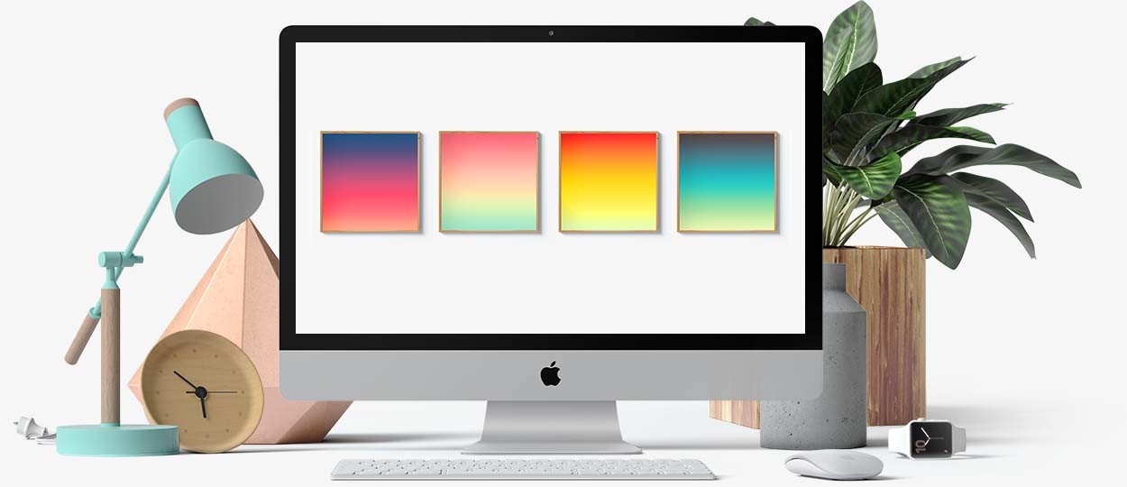
| The soft transition of colors creates unreal depth to visual elements |
|
| | | | Gradients let designers create something that feels new by blending colors. A color that didn't exist before you mixed them, a color that looks unique, modern and refreshing, creating a more dimensional appearance.
Gradients are everywhere. Be it in nature, fruit, leaf you see has a gradient from a light color to a darker shade in the shadows. The sky always has a gradient from an unsaturated hue to more saturated color as you go farther away from the horizon. | 1. Choose the right colors: In order for the gradient trend to look well-designed, you can either choose colors that are similar shade and hue, or color schemes that follows the color theory can equally works well too. Make sure the colors you choose also matches your brand palette. You do not want to mess around with it. | 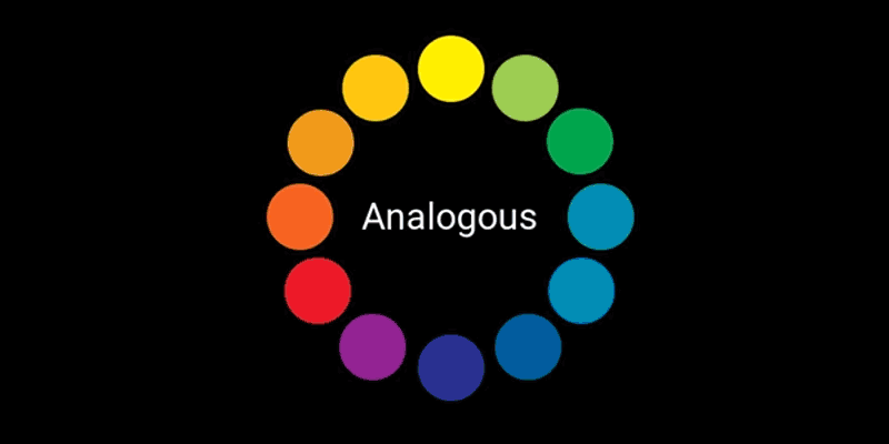 | 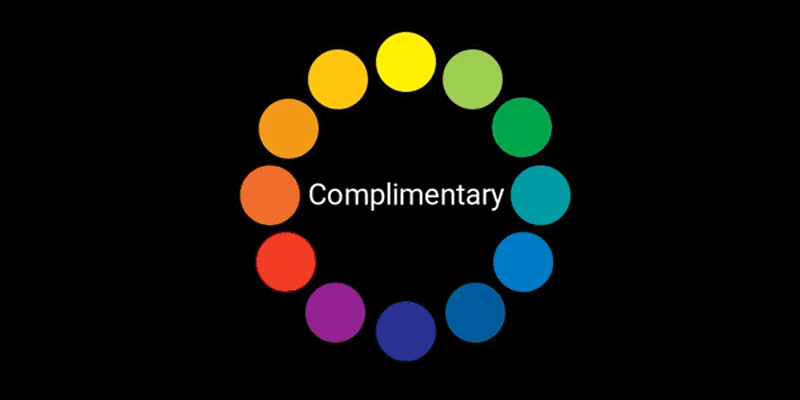 | 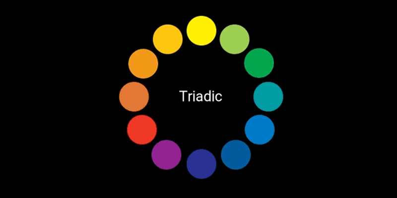 | | 2. Know your audiences: If you want your gradients to have the right effect, you need to really know your audience and what kind of design they're going to respond. For example, if you're marketing to a group of more traditional businesspeople, a neon pink and yellow gradient probably isn't going to be your best bet.
Know your audience, and then choose the right gradient—the colors, how you incorporate them into your design, and whether you take a loud or quieter approach. |  | 3. Have fun with it: Most importantly, make it fun. This is a fun trend, try to play with multiple colors to find out what works best for you. This isn't a trend that's meant to be taken super seriously, so let loose and hav fun with it. |  | | | | |
|
|


No comments:
Got Something to Say? Thoughts? Additional Information?